Digital dashboards are essential tools in the modern business world, providing real-time data insights and analytics. However, their effectiveness can be hampered if not optimized correctly. Visual content optimization is a key factor that can enhance the functionality and user experience of your digital dashboard. In this blog, we’ll explore the importance of visual content optimization and how it can transform your digital dashboard.
Understanding Visual Content Optimization
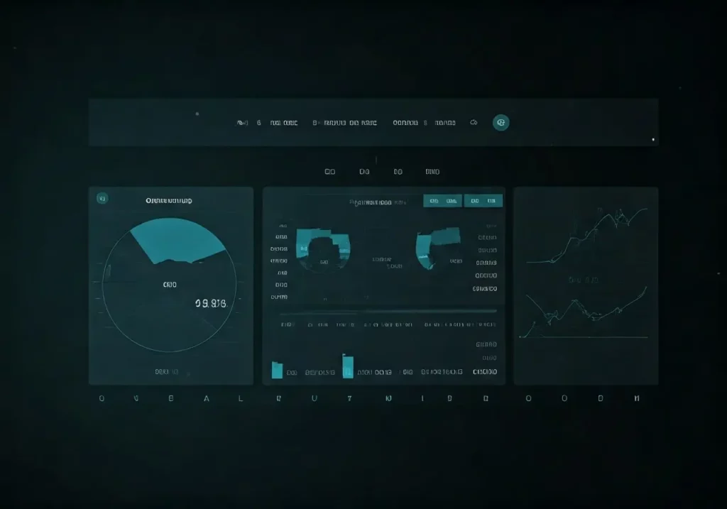
Visual content optimization involves tailoring the visual elements—such as graphs, charts, and images—on your digital dashboard to be more effective and user-friendly. This process includes selecting the right colors, layouts, and imagery, ensuring they convey information clearly and efficiently. It’s not just about aesthetics; it’s about function. For instance, choosing the right image formats and compressing them can significantly reduce load times and enhance the user experience.
The importance of optimizing visual content goes beyond just making your dashboard look good. By thoughtfully integrating visual elements, you make data more accessible and understandable. Consider how complex data sets, when represented as intuitive visual elements, can help users make quicker, more informed decisions. Visuals act as a bridge, transforming raw data into meaningful insights that can be easily grasped at a glance.
Moreover, well-optimized visual content can help reduce cognitive load. When users don’t have to expend extra effort to understand what they are looking at, they can focus on making decisions based on the data presented. This is particularly crucial in fast-paced business environments where time is of the essence.
Why Visual Content Optimization Matters
A well-optimized visual dashboard can greatly enhance user experience and decision-making. Clear, visually appealing dashboards reduce cognitive load and make it easier for users to interpret data quickly. This can lead to faster insights and more informed business decisions. For example, a clutter-free dashboard with distinct color-coded elements allows users to immediately identify key performance indicators and trends.
Furthermore, visual content optimization contributes to better usability. Usability is crucial for digital dashboards because it ensures that users can navigate and interact with the data seamlessly. A visually optimized dashboard minimizes the risk of user errors and enhances overall satisfaction. This improved usability not only speeds up data interpretation but also encourages frequent usage, making the dashboard an integral part of daily business operations.
Lastly, visually optimized content can improve accessibility. By using high-quality images, clear fonts, and well-designed layouts, dashboards become more accessible to users with diverse needs. For instance, implementing alternative text for images can benefit visually impaired users who rely on screen readers. Thus, visual content optimization ensures that your dashboard is inclusive and usable by all team members, enhancing collaboration and productivity.
Key Elements of an Optimized Dashboard
Some of the key elements to focus on include color schemes, typography, spacing, and the use of icons or imagery. Ensuring these elements are harmonized can create a more intuitive and pleasant user experience, leading to better data comprehension and user satisfaction. For instance, choose color schemes that are not only visually appealing but also functional in highlighting different data points.
Typography plays a crucial role as well. Selecting the right font sizes and styles ensures readability and reduces eyestrain. Consistent use of fonts across the dashboard makes it look organized and professional. Spacing is another critical element. Proper spacing prevents the dashboard from looking cluttered and makes it easier for users to find and focus on important information.
Icons and imagery need to be used judiciously. Choosing relevant and high-quality icons can make navigation intuitive. Images should be optimized for SEO purposes as well—by providing descriptive file names and alt texts, you can improve both the visual appeal and the search engine ranking of your dashboard content.
Best Practices for Visual Content Optimization
Adopting best practices for visual content optimization includes keeping designs simple and uncluttered, using color effectively to highlight key data points, and employing consistent visual themes. For example, a minimalist layout with a well-chosen color palette can direct user attention to the most critical metrics. Consistency in design elements leads to familiarity, which makes the dashboard easier to use over time.
Regular updates and reviews of your dashboard’s design ensure that it stays relevant and effective. Periodic reviews allow you to make adjustments based on user feedback and evolving data needs. Moreover, keeping the dashboard aligned with current design trends can enhance its aesthetic appeal, making it more engaging for users. This continuous improvement approach helps in maintaining an efficient and user-friendly dashboard environment.
Additionally, consideration should be given to load times. Compressing images and using responsive designs can improve overall performance, particularly on mobile devices. Implementing lazy loading for images that are not immediately visible on the screen can significantly reduce initial loading time, enhancing user experience. These practices not only make your dashboard more efficient but also keep the users engaged by providing a smooth and responsive interface.
Tools and Resources for Optimization
There are numerous tools available to help with visual content optimization. Graphic design software like Adobe Illustrator or online resources like Canva can provide necessary templates and design elements. These tools allow you to create custom visuals that align with your brand and data representation needs, ensuring that your dashboard maintains a professional and cohesive look.
Analytics tools also offer built-in features to enhance dashboard visualizations. For example, platforms like Tableau and Power BI provide advanced visualization options that can be tailored to your specific data requirements. These tools offer a range of customization options, from color schemes to interactive elements, making it easier to create meaningful and engaging dashboards.
For those who prefer a simpler approach, various free resources like Canva provide user-friendly interfaces and drag-and-drop functionalities. These resources can be particularly useful for small businesses or teams with limited design expertise. Regardless of the tool you choose, the goal remains the same: to create visually compelling dashboards that enhance data understanding and user engagement.
Case Studies: Success Stories in Dashboard Optimization
Several businesses have successfully implemented visual content optimization to great effect. For instance, a retail company enhanced their sales dashboard with better visuals, leading to more insightful data analysis and improved sales strategies. By integrating various optimization techniques, they made their dashboard more user-friendly and visually appealing, which in turn, facilitated quicker decision-making.
Another example includes a healthcare provider optimizing their patient data dashboard, resulting in better patient management and care. The use of color coding and simple chart designs enabled healthcare staff to quickly identify patient needs and track treatment progress, thereby improving overall efficiency and patient outcomes.
In the tech industry, a software company revamped their project management dashboard by incorporating real-time data visualization and interactive elements. This not only improved team collaboration but also increased transparency in project timelines and milestones. The result was a more efficient workflow and enhanced project delivery times.
Enhance Your Digital Dashboard with Visual Content Optimization
Optimizing visual content is not just a design choice; it’s a strategic move to boost the performance and usability of your digital dashboard. By improving the visual elements, you can ensure better data readability, user engagement, and overall efficiency. Start implementing visual content optimization techniques today, and watch your digital dashboard become a powerful tool for your business.